Before exploring restaurant menu design, you must understand the importance of branding for businesses. Having a cohesive brand identity gives you a clear direction for your marketing efforts. As a result, you can more easily stand out, cultivate customer loyalty, and become a recognizable name. For example, Knorr wouldn’t be Knorr without its iconic cursive typeface and signature avocado green color scheme.
If you’re trying to break into the saturated restaurant scene, a stellar first impression is even more critical to the success of your start-up. Everything you show customers should relate to your brand; otherwise, you risk drowning in a sea of similar ventures.
Think of it this way: your restaurant’s menu is only one expression of your overall branding. As such, its design should draw from existing elements specific to your brand, such as color palettes, symbols, and typography. Ideally, a customer will see your menu and immediately understand your brand better.
How to Make a Menu That Reflects Your Brand
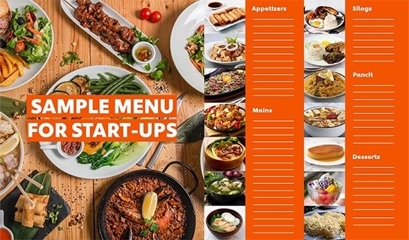
Your menu should reflect your brand, from its color scheme to its typography.
All that said, restaurant menu design isn’t as simple as slapping a list of dishes onto an existing template. It should be consistent with your brand identity. Who does your restaurant primarily cater to? Are you trying to be the go-to date night spot for city-loving millennials? What type of cuisine do you celebrate with your dishes?
You’ll want to incorporate the most distinctive qualities into your menu design. Once you figure out what those are, you can go into more practical considerations, like layouts and whether or not to use photography. Here are a few tips to guide your creative process.
1. Create menu sections based on food categories.
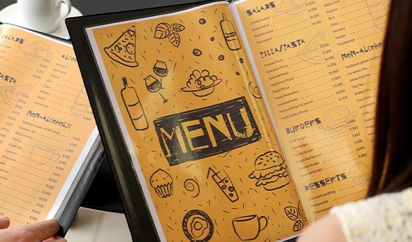
Make your menu easy to navigate by separating dishes into categories.
First, plan your menu. Aim to have one that balances dishes, ingredients, price points, and other factors. After determining your menu’s contents, list the courses under easily navigable categories.
Separate your appetizers from entrees and drinks from desserts. That way, your customers won’t be overwhelmed by their options. You can also add inserts for limited-time offers, such as a dedicated lunch or dinner menu. One trick is to show desserts separately or after the main course, so patrons place additional orders to round out their meal.
2. Include short but impactful descriptions about each dish.
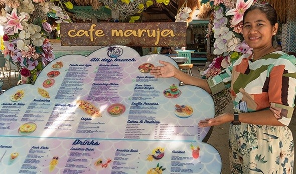
Use the power of words to make your dishes as appetizing as possible.
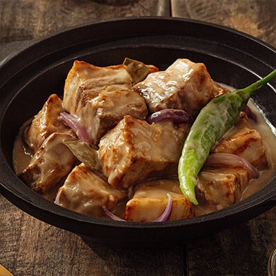
Use evocative language to describe your dishes. Mention characteristics that set them apart from similar items, such as specialty ingredients. Customers are more likely to crave a a “slow-braised chicken and pork adobo with roasted garlic” over a “modern adobo.” If you’re partners with an established brand, you might want to mention them for added credibility. For example, you can say your signature salad “features Lady’s Choice Caesar Dressing.”
Be vivid but keep your sentences clear and concise. Aim for no more than 15 words per description and avoid using terms that only pro chefs will understand. Otherwise, you risk alienating your patrons. Alternatively, use bullet points to improve readability and flow.
3. Feature high-quality photos of your priority dishes.
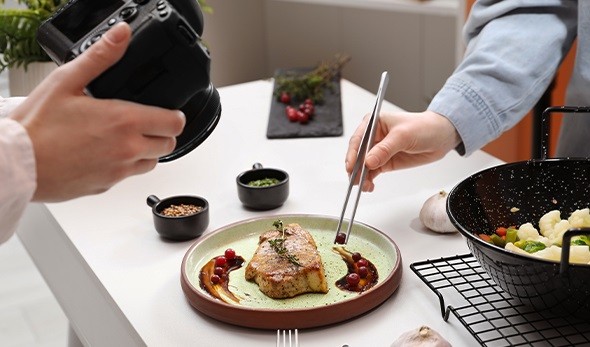
Invest in professional food photography services to showcase your dishes.
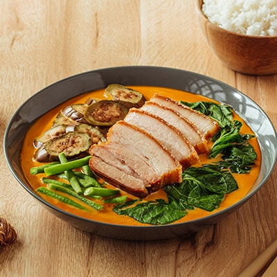
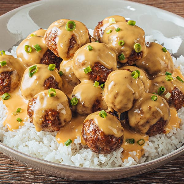
Words aren’t always enough to capture the appeal of a dish. It’s why many restaurants invest in food photography. Your featured photos should be well-styled, well-lit, and professionally edited to show items in their ideal form.
If your mouth waters when you look at the final snaps, your patrons will probably have the same impression. Some establishments have photos alongside every menu item, but you can opt to give only the most visually appealing, profitable, and unique dishes this treatment. Doing so will also keep your menu from becoming too cluttered or hard to navigate.
4. Choose an easy-to-read menu layout and typography.
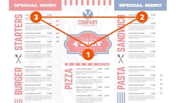
Follow the “golden triangle” when laying out your menu.
Have you heard of the golden triangle? According to menu engineers, your eyes typically move in a triangle when assessing a menu. They’ll start at the center of the page before traveling to the top right corner, followed by the top left. As such, you’ll want to feature your most profitable or signature dishes in these areas, so customers spot them immediately. Use callouts, i.e., “bestseller” or “chef’s choice,” to further draw the eye towards priority items.
As for the typography, sans-serif fonts are slightly more readable than serif fonts. But whatever typeface you choose, try not to combine more than two on one page to maintain a streamlined look. When writing out prices, nix the currency symbol and decimals (go for round numbers whenever possible!), so pricing doesn’t appear as dominant within the text.
5. Improve user experience using real feedback.

Keep improving your menu design based on user feedback.
Once you’re happy with your initial design, print out your menus using high-quality materials that suit your restaurant. For example, in some establishments, recyclable paper menus double as placements. But before you put your menus to use, it helps to run a trial first. Have your staff read through it to share their user experience.
If they have any feedback, incorporate them into new versions of your design until your menu is as user-friendly as possible. This helps ensure that your concept is equally effective in real-life scenarios. Consider seeking the advice of a professional graphic designer during this step. And, of course, periodically check in with your patrons to see if there’s still room for improvement.
3 Menu Design Ideas to Get You Started
Not sure what “aesthetic” you want for your menu? Here are a few ideas that can apply to different restaurant concepts. Choose the one that aligns with your branding and start designing from there.
Idea #1: Minimalist
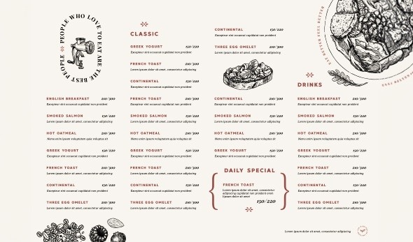
A minimalist menu features lots of white space and illustrations.
You’ll find minimalist menus in many fine dining restaurants, especially those specializing in small plates or tasting menus. Some characteristics of this style include minimal text, lots of white space, clean lines, muted or neutral colors, and illustrations over photos.
Idea #2: Mouthwatering
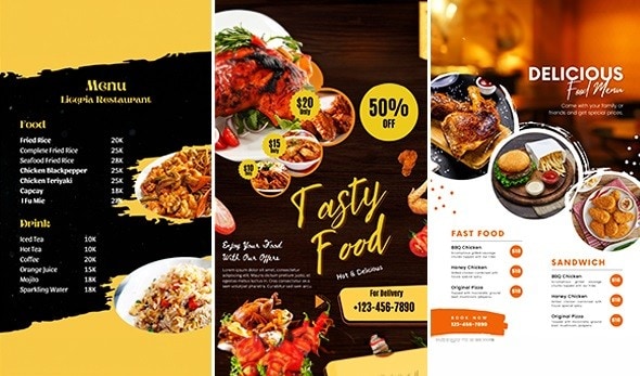
Invest in mouthwatering food photography for this menu type.
This style is a staple of casual or fast-casual restaurants like Chili’s and Cibo. These establishments rely heavily on food photography to market their dishes since “the eyes eat first.” Other features of a mouthwatering menu include expressive descriptions, eye-catching callouts, and mentions of top-shelf ingredients.
Idea #3: Fun and family-friendly
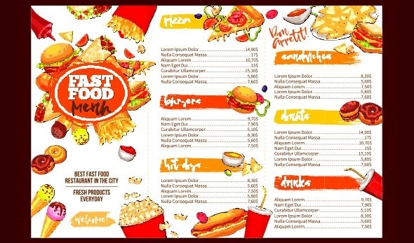
Use bold colors and graphics for this menu type.
This one is popular among fast-food chains, but some fast-casual and buffet-style restaurants also use it. These menus are typically bold, colorful, and easy to read. They’re also an opportunity to be more creative or “branded” with your copywriting. For example, instead of “salads” or “desserts,” maybe your spot offers “nourishing greens” or “sweet treats.”
Now that you know the basics of restaurant menu design, you can confidently jump into the creative process. Keep branding and customer experience in mind, and you should be able to develop a winning, one-of-a-kind menu!
